Reveal
Use the restaurant’s layered interiors, collected objects, warm color, and mountain-town eccentricity as the visual grammar—not decoration placed around a generic restaurant layout.
An independent redesign that brings Secret Stash’s collected interiors, worldly story, signature food, and Crested Butte mischief into one intentional digital experience.
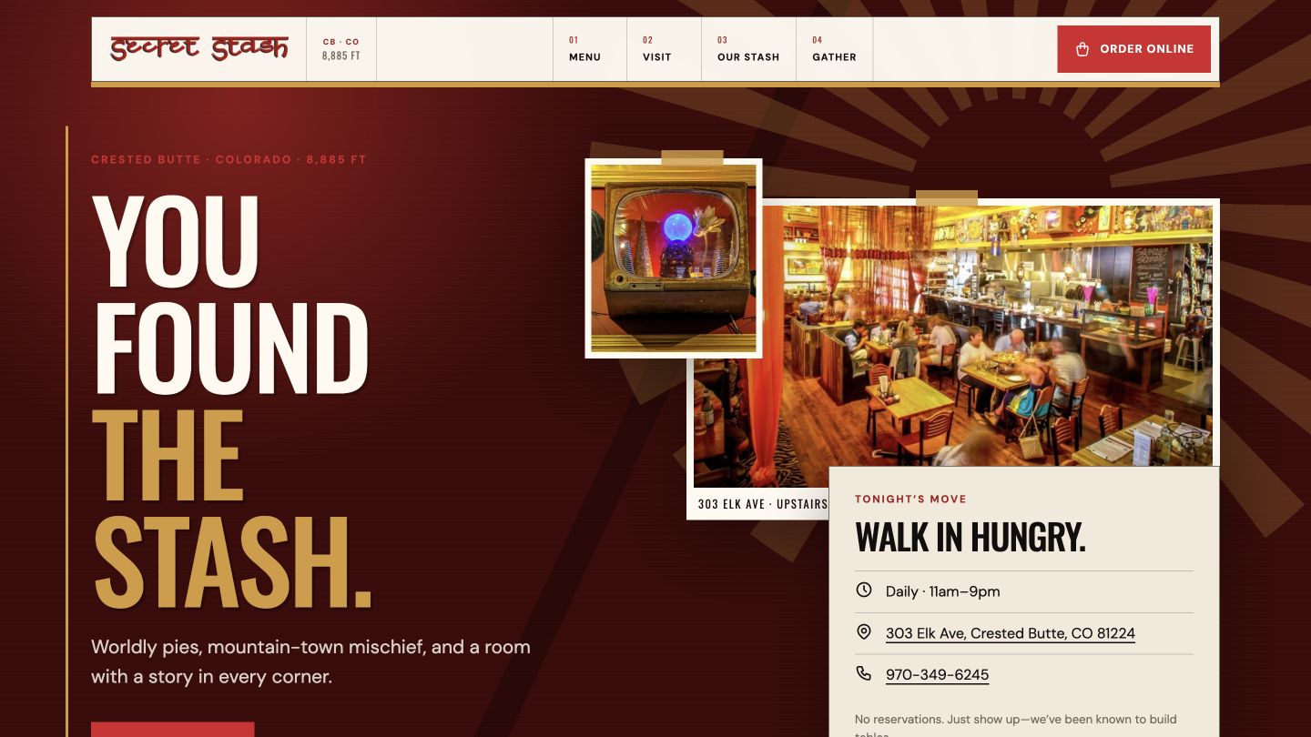
Captured at the same desktop viewport. The redesign remains a private, uncommissioned proposal while its owner presentation is pending.
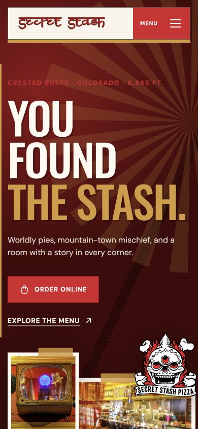
The mobile version is not the desktop page squeezed smaller. Hierarchy, navigation, imagery, and actions are recomposed for the space available while preserving the same character.
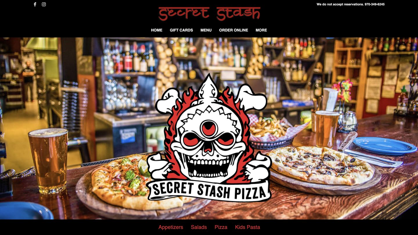
The current site contains useful information, recognizable photography, ordering links, and years of restaurant history. The opportunity was not to replace that equity—it was to connect it. The redesign gives the room, the food, the walk-in experience, and the stories behind the Stash a clearer hierarchy while keeping menus, ordering, location details, gatherings, and community programs within easy reach.
Use the restaurant’s layered interiors, collected objects, warm color, and mountain-town eccentricity as the visual grammar—not decoration placed around a generic restaurant layout.
Make the essential guest decisions immediate: understand the walk-in experience, explore the menu, order online, and find the restaurant without searching through the story first.
Connect signature dishes, restaurant history, large orders, private events, and Stash Cash so the site represents more than a single transaction.
Each visual decision answers something observed in the existing experience. The comparison is less about decoration and more about what the website asks guests to notice and do.
The current site introduces the logo and photography, but gives the first viewport little hierarchy or sense of arrival.
A composed opening combines a direct invitation, layered imagery, and immediate access to the walk-in model, location, menu, and ordering.
Menu, ordering, contact details, and the no-reservations policy are available, but require guests to assemble the visit across separate areas.
Core actions are grouped by intent, while the walk-in experience is stated early enough to set expectations before arrival.
Signature food, founder stories, events, community programs, and the physical character of the restaurant appear as separate pieces.
The redesign connects those details into one narrative, making the website feel like an extension of the place rather than a directory around it.
This is independent concept work, not commissioned client work. The website is complete enough for a private demonstration, with presentation and commercial discussions still pending.